PNotify 5 will come with a brand new notification flow, called modalish. This flow is developed to provide a good user experience, even when many notifications are shown at once.
Edit 2020-04-20: PNotify 5 is out! You can use the Modalish flow in production code now!
The problem
I use PNotify on my project at work, and we have a big problem with it. We show a notification for every network error, and sometimes things go down, and there are a lot of network errors. PNotify v4 does not handle this well. You get a screen full of error messages that you probably just want to dismiss all at once.
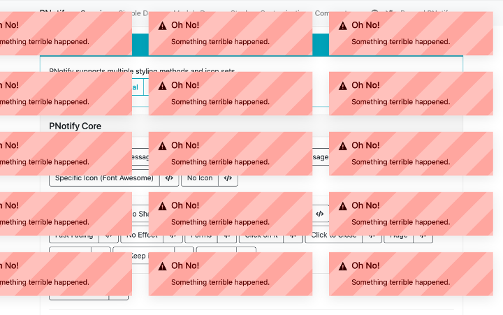
One of PNotify’s goals is to be unobtrusive, but that’s obnoxiously obtrusive. I’ve been tossing around ideas to fix this problem for a while. It seems like no other web notification libraries or design specs have landed on a good solution for this. The current industry practice is to simply have notifications wait their turn. This keeps the user from being able to see all the pending notifications at once and dismiss them en masse.
I think I’ve come up with a good solution, so I’d like to introduce you to
PNotify 5’s modalish flow
PNotify 5 has a radically different default flow from PNotify v4 and earlier. Since I came up with the flow, I get to name it, and since it’s not quite modal, but it’s also not quite non-modal, I call it “modalish”.
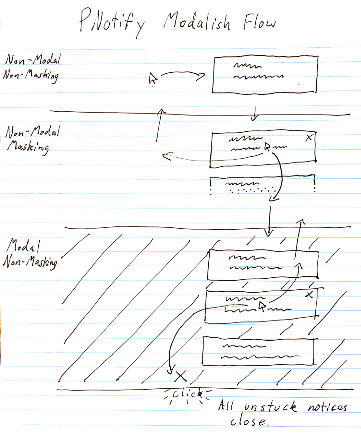
Modalish has three states the user can freely flow between by movements of either the cursor or the focus target.
Without interaction, notifications appear on the screen in order, just like the industry standard. When the user interacts1Moving the cursor over an element or giving it focus are both considered “interacting” with the element. with the “leader”, which is the notification that is showing in the “non-modal, non-masking state”, the next waiting notice starts “masking”, which means it shows a portion of the notice. If the user then interacts with the masking notice, all waiting notices open and the “modal state” is entered.
In the modal state, notices don’t automatically hide after a timer, but the user can still dismiss them individually. The user can also dismiss all of them by clicking on the modal backdrop, which is indicated by the large “×” on the backdrop. If the user would like to keep certain notices around, they can be individually pinned, which keeps them from being closed when the user clicks the backdrop.
If the user begins interacting with the leader while in the modal state, all notices except the leader are closed and become waiting, the modal state is exited, and the next waiting notice after the leader begins masking. The user can now stop interacting with the notices to go back to the plain old industry standard flow.
Try it out
As of the time of this writing, there is a rough working version of the modalish flow available on PNotify’s development site! A lot of the positioning code needs to be updated to handle the new flow, so you’ll notice that leaving the modal state tends to break positioning (which is why there is no video demonstration of that). Don’t worry! I’m working hard on fixing all the issues, and PNotify 5 with all this modalish goodness will hopefully be out soon!
Edit 2020-02-13: The positioning issues when leaving the modal state have been fixed. The demo is now mostly working. I added the missing video demo.
Edit 2020-04-20: PNotify 5 is out! You can use the Modalish flow in production code now!
Afterthoughts
The solution we decided to go with at my work up to this point is to add a notification at the end of the stack with a big button labeled “Close All”. This is the epitome of software engineers doing UX design2“We have a problem scenario.” “Ok, when that scenario happens, let’s add a button labeled ‘Solve This Problem’.”. I want PNotify to provide an elegant and rich experience to users that they really enjoy using. So rather than adding a button to solve their problem, PNotify shouldn’t be a problem in the first place.
This is really my first attempt at solving an industry problem like this by doing UX design. I’m not a UX designer. If you have some constructive criticism, or just feel the need to chime in (maybe by saying “Oh, Hunter, your notification design is so pretty. That must have taken a long time. Great job there, kiddo.”), leave a comment below and I’ll try to respond. ?